1. Introduction
With TolaData, you can build fully customized dashboards that can be shared with both internal team members and external stakeholders. You can create an unlimited number of dashboards and enrich them with elements such as text, images, and visualizations of your indicator results, including disaggregations and cross-indicator comparisons. All data displayed on a dashboard is updated in real time, ensuring that charts and visualizations always reflect the most current information.
2. Share a dashboard
Dashboards can be shared with stakeholders who are not TolaData users via a unique URL. This is an effective way to distribute reports and keep all external stakeholders continuously informed about your activities.
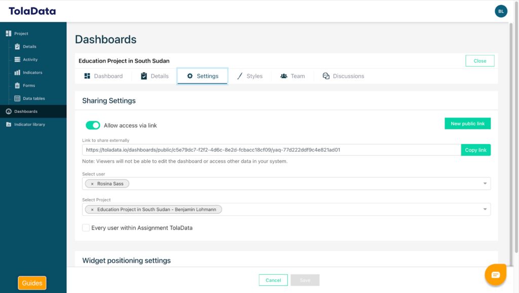
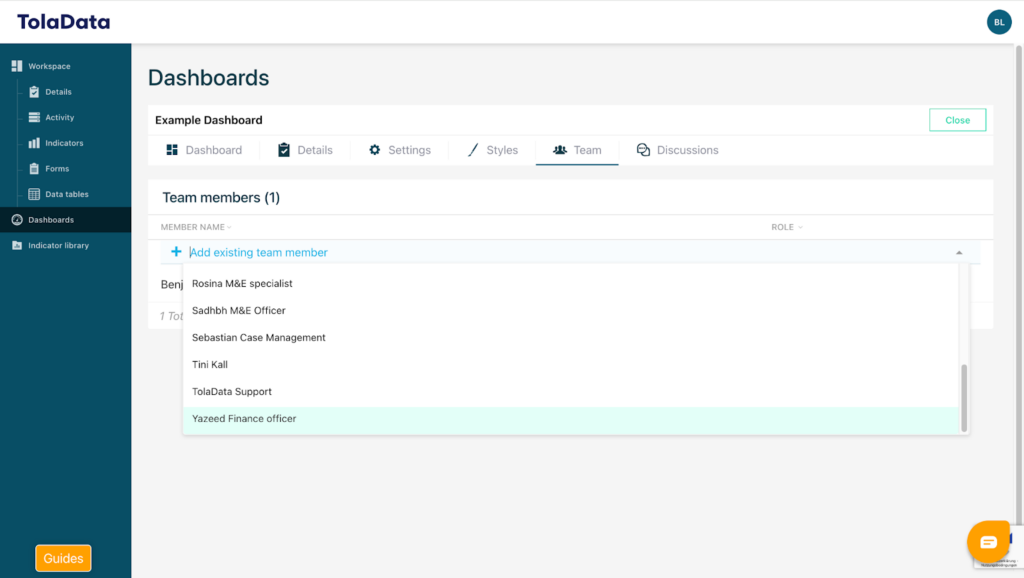
You can also share your dashboard TolaData internally or work on it collaboratively with other users.
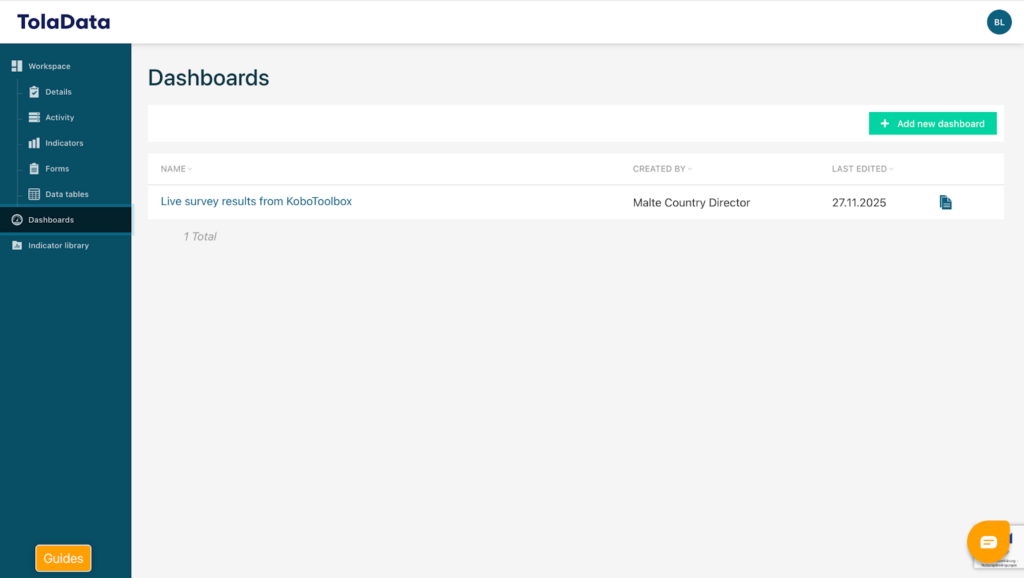
3. Create a Dashboard
To create a new dashboard, click on “Add New Dashboard” and enter a name for your dashboard. Once saved, your new dashboard will be created and ready for use.
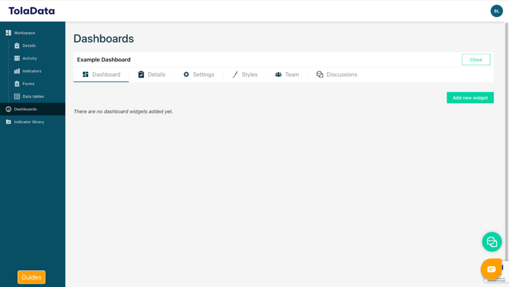
4. Add a Widget
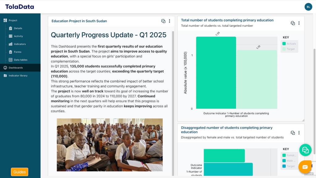
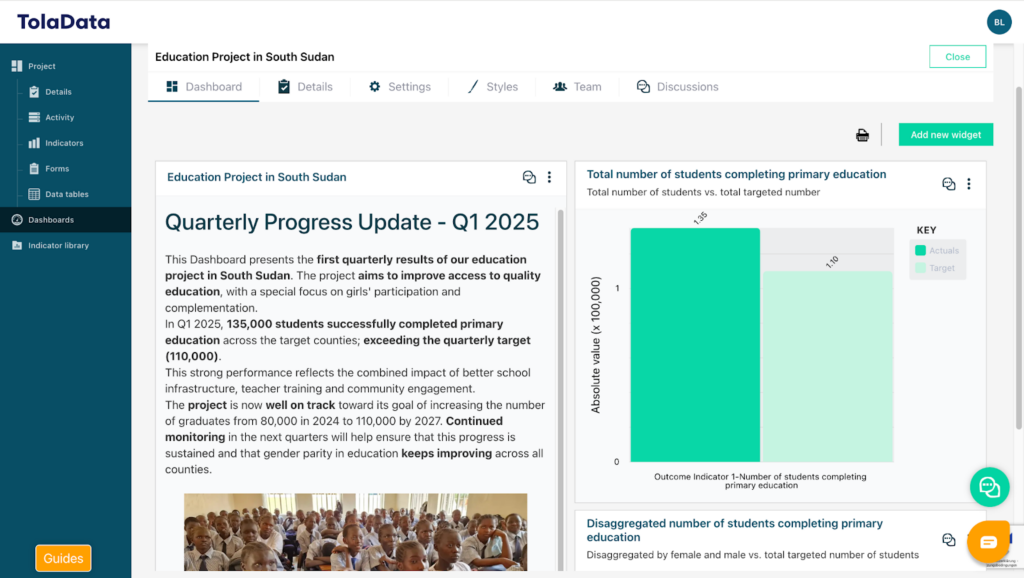
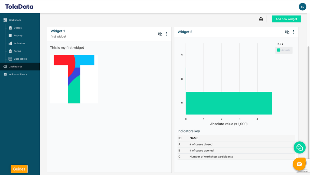
Your newly created dashboard will initially be completely blank, giving you full flexibility to design according to your specific needs and preferences. Each box within the dashboard is referred to as a “widget”. To add a new widget, click on the green “Add New Widget” button.
Various widget types are available, including Text and Image, Project Indicators, Map Data and Budget Data.
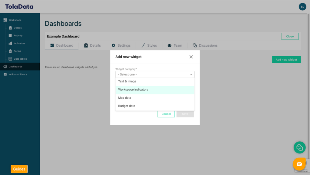
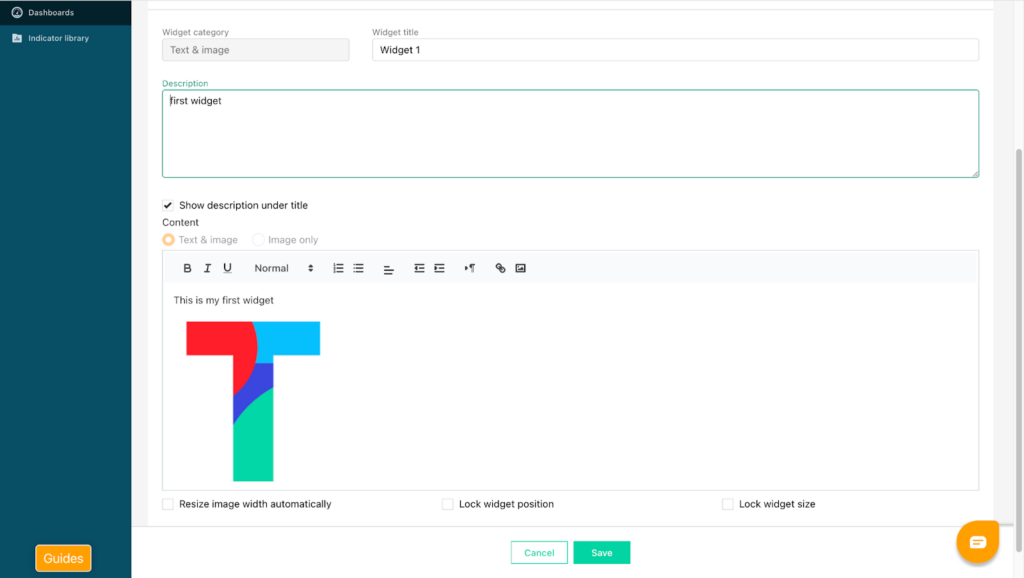
To begin, select the Text and Image widget. Enter a title and description for your widget and add your text in the field below.
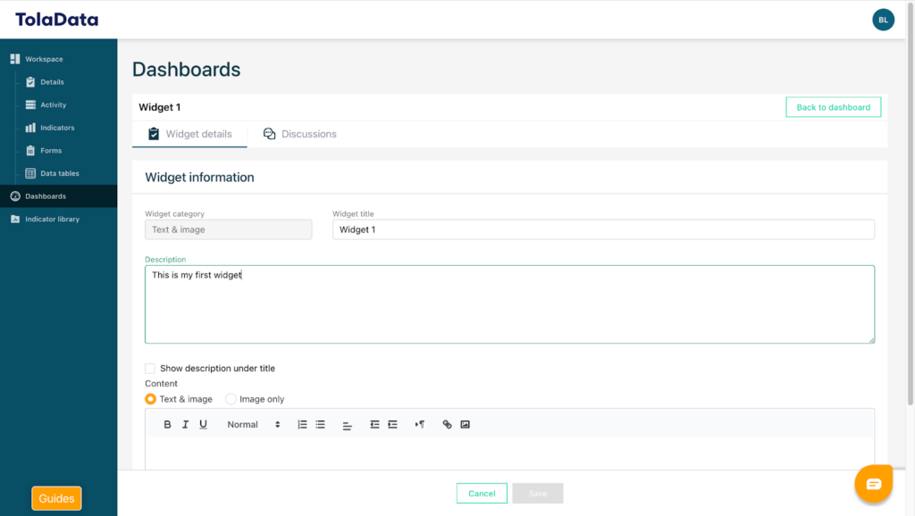
You can adjust the font size, add hyperlinks, and format the content as needed. You may also upload images. Once selected, images will automatically resize to fit the widget dimensions. Click “Save” to add the widget to your dashboard. You can then proceed to add widgets that include charts to visualize indicator results.
5. Add Charts
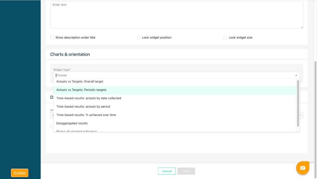
To add a chart, click the green “Add New Widget” button again and select “Workspace Indicators”.

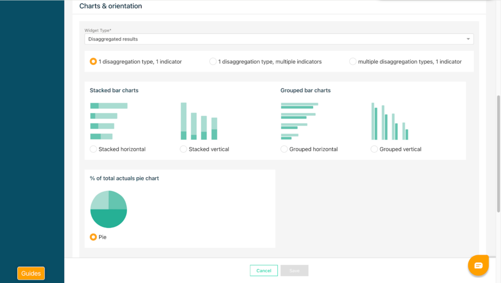
You can choose from seven different chart types, including Actuals versus Targets, Percentage Achieved to Date, Progress Over Time Against Targets, and Disaggregated Results.
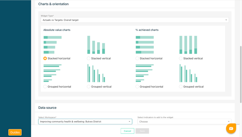
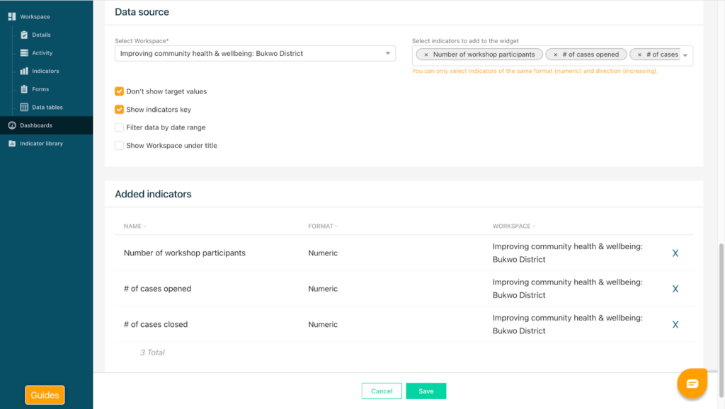
As an example, we will create a widget that displays Actuals versus Targets in absolute values. After selecting the chart type, choose the project from which the data should be pulled.
Then specify the indicators you would like to include.
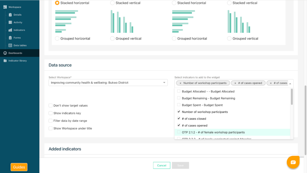
Next, configure the display options. You can choose whether to show target values, whether to include an indicator key, and whether to filter the results by a specific date range. You may also add a custom title and a description for the widget.
Once all required information has been entered, click “Save”, and the widget will appear on the dashboard. The widget can be resized and repositioned by dragging it. By hovering over the chart, you can view the actual versus target values for each indicator.
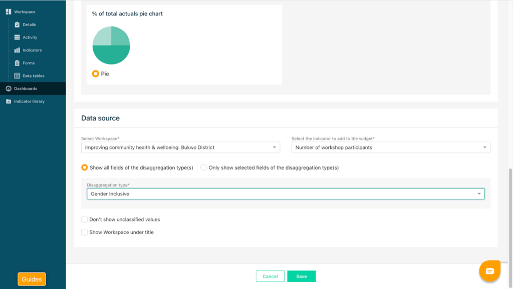
To add another indicator widget, click the green button again and select Disaggregated Results. Choose to show 1 disaggregation type and 1 indicator. In other cases, you can present 1 indicator and multiple disaggregation types as well as multiple indicators and 1 disaggregation type on your widget. Choose a disaggregated pie chart, then select the project and the indicator.
For disaggregation charts, select the disaggregation type you would like to display. All available disaggregation options for that indicator will appear in the drop-down list. You can select to show all fields available for this disaggregation type or to only show selected fields of this disaggregation type. Click Save to display the results on your dashboard.
For more detailed information about widget types and configuration options, please refer to the Youtube video guide which you can access via this link:
https://www.youtube.com/watch?v=ux-IGWgwPFE