How to get your dataset ready for analysis
June 14, 2018
Whenever teams create datasets, they often devise a system that works for their specific use case. What happens when you wish to integrate your datasets into dashboards and analytical tools? We’ve put together a list of best practices to guide you and your team in setting them up to get more out of the data you’ve collected. Take a look!
1. Laying out data
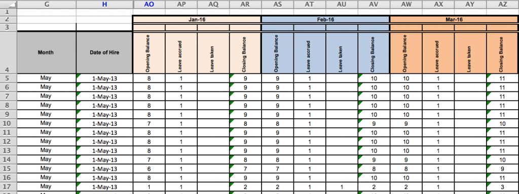
Datasets are commonly formatted in the following manner (see example below) so that they’re visually appealing and easy for users to understand.
For instance:
- Multiple rows at the top of the data are used for levels of column headers
- The actual data starts a few rows below the top of the sheet
Why?
- This leaves some room at the top for explanatory, introductory information or style;
- And makes it possible for team members to quickly understand the data they are looking at
However, this might create problems later during analysis.
💡 Our suggestion
For easier analysis and visualization of the data in your dataset, simply make a few changes to its layout, like in the example below.
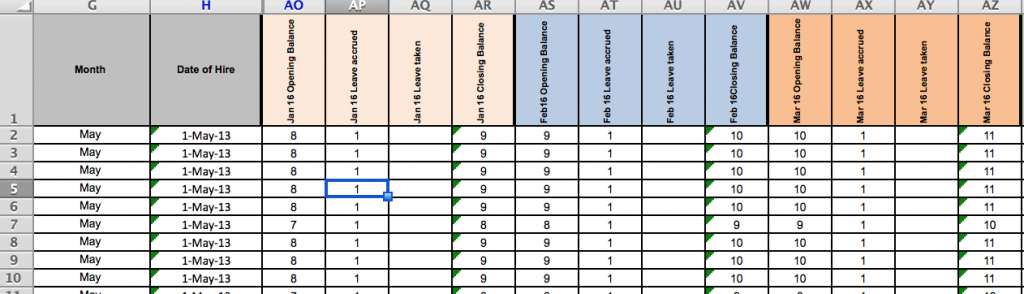
- Use only one row of column headers for the dataset, with no multi-level or merged cells. In places where you’ve used a two-level column header, simply combine the info in the top and bottom levels for each column.
- Data should start in cell A1 of the spreadsheet — make sure there are no blank rows above your data! This makes it easy to import your data into analysis and visualization software.
- Try not to merge cells anywhere in your dataset.
- Notes, comments, associated graphics or images belong in a separate read-me file; not in the dataset itself.
2. Structuring your data
When entering data into your dataset, keep in mind these do’s and don’ts. They can influence the ease of analyzing your data or creating dashboards and visualizations based off it.
a) “Long” vs. “wide” format
Do | Don’t | |
Enter data in the “long” format (see example below) | Enter data on the “wide” format (see example above) | |
What does it mean? | Additional rows hold the information | Additional columns hold the information |
Why? | Easier to analyze data | Harder to analyze data |
Example | If the dataset were to be organized in a “long” format, rather than separate columns for each month, there would be a single column labeled “Month”, with values in the rows below that indicate which month the data corresponds to. | The dataset is organized in “wide” format — there are additional columns added to the dataset for each month of data that is being tracked. |
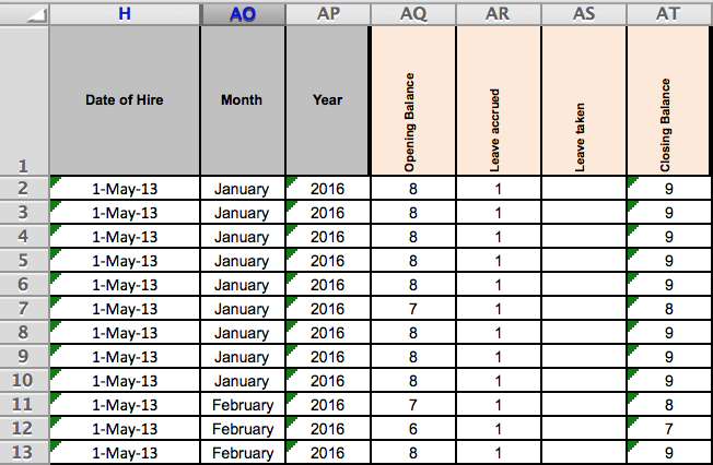
Example: “Long” format
If you have already created a dataset in the “wide” format, you don’t have to spend the extra time to reorganize it to be “long”.
However, if you are setting up a new dataset or don’t have much data in your dataset, consider using the “long” format as you’ll find it much easier to analyze and visualize your data.
b) Amount of information in each cell
Do | Don’t | |
Enter only a single data point in each cell of the dataset | Enter lots of data points in a single cell | |
What does it mean? | Split multiple values into two (or more) rows with the correct numbers tied to the correct identifying features | To have multiple values in one row |
Why? | Easy to quickly calculate total beneficiaries, or beneficiaries by nationality, sex, age, or a combination of them | Data entered in this manner is almost impossible to analyze |
Example | When you have disaggregated data such as sex or age, it’s helpful to enter the male and female data points separately. This makes it easy to calculate the total as well as verify how they add up. | When you sum up the data in the same cell, it can be very challenging to disaggregate the data without checking with another source. This makes it difficult to conduct a detailed analysis and you might find yourself digging up old records to verify. Before you organize your dataset, create a plan so that you know what you’re analyzing. |
More important than the “wide” vs. “long” decision is that each cell of your dataset contains only one piece of information.
See what happens when you combine lots of information in a single cell when entering Sex and Age Disaggregation Data (SADD) beneficiary data, for instance.
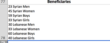
Is it possible to analyze data which has been entered in this way? Nah.
There is no quick way to sum up all beneficiaries to arrive at a total, and if there were many cells like these, there is also no quick way to get a total of how many beneficiaries of each nationality and sex there are.
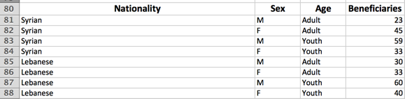
How about a better way like this?
3. Entering your data
You might feel in control when you first start to enter data into a dataset. This is because the dataset is small and you have a good overview of all the information that you’ve put in so far. Once the dataset gets bigger, however, difficulties start to show up.
One common problem lies in inconsistency. For example, some people may enter Gaziantep as “Gaziantep”, while others name it “GTZ”. It’s a good idea to plan out on how you’d like to validate (in other words, ensure the accuracy of) the data in your dataset. Data validation gives you control over the type of data entered in each column of data, ensuring that numbers stay numbers, dates show up as dates, and so on.
Digital data collection tools can:
- Speed up data collection
- Improve data quality
- Make data clean and easily to use for analysis
4. Conclusion
Whether you’re calculating summary statistics or linking datasets to data visualization and dashboarding tools, may best practices help you accomplish more with the data you’ve gathered.
Consider using an M&E platform like TolaData to generate datasets that adhere to these best practices. We’re not fans of overcomplicating things, which is why we’ve designed a user-friendly interface for entering your data, as well as features that support exporting your data in an analysis-ready format.
Last but not least, when it comes to spreadsheet dataset, we’d highly recommend using Google Sheets instead of Microsoft Excel to facilitate sharing, collaboration, and keep your data safe in the unfortunate event when your computer crashes.
You can even install the Google Drive Offline app to sync your files to your computer so that you can access and work on them offline. It’s also good practice to link your dataset from a digital data collection tool or Google Sheets to Track to use the data as evidence in your indicator plan, or share it out as a live stream using Track’s JSON feed.
We hope you’ve found our tips useful in preparing your datasets for analysis. Don’t hesitate to let us know what worked (or didn’t work 😯) for you — we’re open to feedback!