Power up your data with dashboards: TolaData’s new features and enhancements
June 14, 2022
The use of dashboards for monitoring and evaluation in the nonprofit sector is gaining popularity. A dashboard is a visual representation of data that can be used to track progress, identify trends, and make informed decisions. Dashboards can be used to track a variety of indicators, such as fundraising progress, program outcomes, or even social media engagement.
Dashboards help to keep the focus on what is important
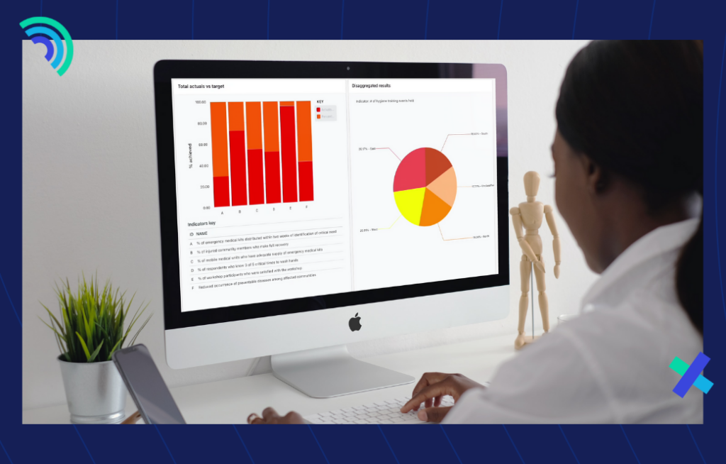
The advantages of using dashboards are clear. Dashboards provide a quick and easy way to visualize data, and they can be customized to meet the specific needs of an organization. A dashboard provides a high-level overview of a project, including implementation progress, key milestones, and budget. It can also be customized to display only the information that is most relevant to the project manager. This allows managers to stay focused on the big picture and make sure that all tasks are completed on time. In addition, dashboards can be used to share information with stakeholders, such as donors, in an accessible and engaging way. As the use of data has become increasingly important in the nonprofit sector, dashboards have become an essential tool for monitoring and evaluation professionals.
Without a dashboard, project management for nonprofit campaigns and projects can quickly become disorganized and bogged down in details, causing a loss of sight of the overall goal and ending up with a campaign or project that is over budget and behind schedule.
Nonprofits already utilising the power of dashboards
The following are two examples of nonprofits that have used dashboards to visualize their monitoring and evaluation processes.
The first nonprofit is a small organization that provides services to families in need. The organization wanted to find a way to track the progress of each family they worked with, so they created a dashboard that showed key metrics such as the number of meals served, the number of appointments kept, and the number of hours of service provided. This allowed them to quickly see which families were making progress and which ones were falling behind, and it helped them to make data-driven decisions about how to best support each family.
The second nonprofit is a large international organization that works on many different programs. The organization wanted to create a dashboard that would allow them to track the impact of their work across all of their programs. They created a dashboard that showed key metrics such as the number of people reached, the number of lives changed, and the amount of money saved. This allowed them to quickly see which programs were having the biggest impact and which ones needed more attention.
Dashboards are an extremely powerful tool for all types of organizations, especially nonprofits. TolaData’s Monitoring and Evaluation tool has been offering powerful dashboard features for many years, used by organizations across the world. Our new dashboard features and enhancements make it easier than ever to create custom dashboards that give you the information you need to make faster and more accurate actions.
TolaData dashboard new features and enhancements
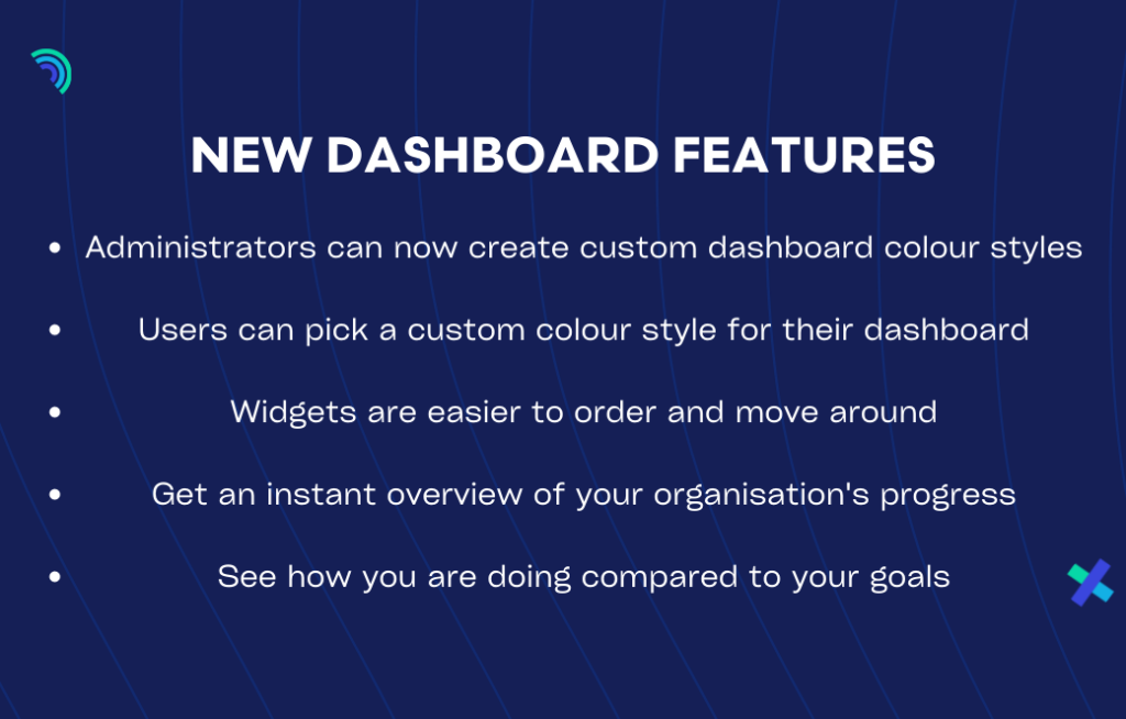
We are excited to bring a range of new features to the dashboard section for our users including the ability for org admins to create custom dashboard color styles, e.g. in the organization’s or a donor’s color scheme. This will allow for greater flexibility and personalisation of the dashboard experience. In addition, users will now be able to pick a custom color style for their dashboard, as well as lock the size and position of their widgets. We have also added a new widget type “Indicator status of selected indicators” which will provide users with an overview of the progress of their chosen goals. These new features are part of our continued commitment to providing our users with the best possible experience.
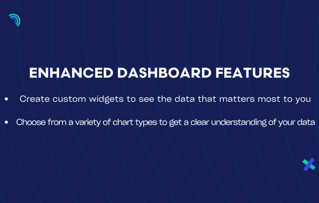
Our dashboards have also undergone a range of enhancements to improve their already powerful functionality. The dashboard section has been improved with a better widget creation interface, the ability for users to pick indicators from different projects within the same widget, and the ability to display charts horizontally or vertically. In addition, significant performance improvements have been made to enhance the user experience. With these improvements, our dashboards are now more user-friendly and efficient than ever before.
Additional new dashboard features and enhancements will be released in the months to come.
We can help get you set up
If you’re not already taking advantage of dashboards in your work, now is the time to start. At TolaData, we offer a walkthrough of our new dashboard features – contact us today to book a session with one of our team members: info@toladata.com
We look forward to helping you get the most out of your data!